There are literally hundreds of CMSs on the market, possibly thousands. So much choice, but often so little satisfaction, judging by the gripes of end-users. Why is the right option so muddled? Old CMS vendors soldier on, and new ones enter the market all the time, promising a better future. How do we make sense of this?
A large part of the answer is the CMS buyer, and CMS users, are different people. The buyer and user have completely different relationships to the CMS. The buyer has either budgetary authority or responsibility for implementing the CMS. The buyer decides what to buy based on budget or infrastructure considerations. They dominate discussions of CMSs during the purchase phase but disappear afterward.
Only after the CMS is purchased do users gain much notice. They now have to “adopt” the CMS and be trained on how to use it. While they may not have had much say in what was purchased, they may nonetheless be hopeful their new solution will be better than the old one. After years of complaining, the user at last enjoys the spotlight. They get a new system and training. However, following a honeymoon period, users may notice the new system has many of the same issues as the one it replaced. Their CMS doesn’t satisfy their needs!
CMSs are hardly unique in sparking user complaints. All kinds of enterprise software generate dissatisfaction. These problems stem from a common practice: the buyers of enterprise software are not the users of the software.
Do enterprises care about internal users? The field of enterprise UX emerged in response to a common situation: enterprise software is often less usable than consumer software. One explanation for why consumer software is better than enterprise software is that developers are unsure what consumers want so they test and iterate their designs to ensure people are willing to buy it. For enterprise software, the user base is considered a known and given quantity, especially if the enterprise application is being developed internally.
Enterprise software has changed dramatically over the past decade. It was once common for such software to be developed internally (“homegrown”), or else procured and installed on-premises (“off-the-shelf”). Either way, enterprise software was hard to change. Employees were expected to put up and shut up. Now, much enterprise software is SaaS. In principle, it should now be easier for enterprises to switch software, as firms shouldn’t be locked in. Usability should matter more now.
What’s good enough? Benchmarking usability. The most common usability benchmark is the System Usability Scale (SUS), which has been in use for four decades. Many software vendors, such as GitLab use SUS. A SUS survey yields a score from 0-100 that can be broken into “grades” that reveal how good the usability of the software is compared to other software, as this table from GitLab shows.
The SUS can be used to assess any type of software. It measures general usability, rather than the specific usability of a certain category of software. It matters little who has the best medical claims reconciliation software if all software in that category is below average compared to overall norms.
Employees aren’t consumers. It’s not straightforward to apply consumer usability practices to enterprise software. Many user experience assessment approaches, including the SUS to some degree, rely on measuring user preferences. The SUS asks users if they agree with the statement, “I think that I would like to use this product frequently.” Yet employees are required to use certain software — their preferences have no bearing on whether they use the software or not.
The ESUS is readily applicable to assessing CMSs — what in the content strategy discipline is known as the authoring experience, which covers the editorial interface, workflow, analytics, content inventory management, and related end-user tasks. These tasks embody the essential purpose of the software: Can employees get their work done successfully?
ESUS consists of just five questions that cover major CMS issues:
Usefulness – whether the CMS has required functionality and makes it possible to utilize it.
Ease of use – whether the CMS is clear and allows tasks to be completed in a few clicks or steps.
Control – whether the CMS empowers the user.
Cohesion – do the CMS capabilities work together in an integrated manner?
Learnability – can the user make use of the CMS without special training?
The ESUS, shown below, is elegantly simple.
ESUS Items
1
2
3
4
5
How useful is this CMS to you?
Not at all useful
Slightly useful
Somewhat useful
Mostly useful
Very useful
How easy or hard was this CMS to use for you?
Very Hard
Hard
Neutral
Easy
Very Easy
How confident were you when using this CMS?
Not at all confident
Slightly confident
Somewhat confident
Mostly confident
Very confident
How well do the functions work together or do not work together in this CMS?
Does not work together at all
Does not work well together
Neutral
Works well together
Works very well together
How easy or hard was it to get started with this CMS?
Very Hard
Hard
Neutral
Easy
Very Easy
Microsoft’s proposed Enterprise System Usability Scale (ESUS) applied to CMS evaluation by employees
How enterprises might use ESUS
The ESUS questionnaire provides quantitive feedback on the suitability of various CMSs, which can be compared.
Benchmark your current state. Enterprises should survey employees about their current CMSs. Benchmark current levels of satisfaction and compare different vendors. Most large enterprises use CMSs from more than one vendor.
Benchmark your desired state. It is also possible to use ESUS for pilot implementations — not vendor demos, but a realistic if limited implementation that reflects the company’s actual situation.
Measure and compare the strengths and weaknesses of different classes of CMSs and understand common tradeoffs. The more separate usability dimensions a vendor tries to maximize, the harder it gets. Much like the iron triangle of project management (the choice of only two priorities among scope, time, and budget), software products also face common tradeoffs. For example, a feature-robust CMS such as AEM can be a difficult-to-learn CMS. Is that tradeoff a given? The ESUS can tell us, using data from real users.
CMSs will vary in their usefulness. Some will have limited functionality, while others will be stuffed with so much functionality that usefulness is compromised. Does what’s out of the box match what users expect? It’s easy to misjudge this. Some vendors overprioritize “simplicity” and deliver a stymied product. Other vendors overemphasize “everythingness” – pretending to be a Swiss Army knife that does everything, if poorly.
CMS difficulty is…difficult to get right. But it matters. Not everyone finds the same things difficult. Developers will find some tasks less onerous than non-developers, for example. But everyone seems to agree when things are easy to do. That’s why consumer software is popular — rigorous user testing has de-bugged its problems, and everyone, no matter their tolerance for nuisance, benefits.
CMSs often fail to give users control — at some point. What’s interesting to look at is where the CMS falls down. Maybe the user feels in control when doing something simple and granular, but is overwhelmed when doing something involving many items at once or a complex task. Conversely, some CMSs are better at batch or exception tasks but impose a rigid process on everyone even to do basic tasks.
Simple CMSs may be coherent, but complex ones often aren’t. Every CMS will be compared to a word processor, which seems simple because it deals with one author at a time. It’s an unfair comparison; it ignores the many other tasks that CMSs support, such as analytics and workflow. But too many CMSs are pointlessly complex. They are mashups of functionality, the shotgun marriage of corporate divisions that don’t collaborate, separate products that were acquired and packaged as a suite, or collections of unrelated products patched together to provide missing functionality.
CMSs vary in their learnability. Some are so complicated that firms hire specialists just to manage the product. Other products require online “academies” to learn them — and possibly certifications to prove your diligence. Still others seem indistinguishable from everyday software we know already until one needs to do some that’s not every day.
Comparing CMSs quantitatively
Over the years, the CMS industry has splintered into more categories with shifting names. It’s become hard to compare CMSs because all want to seem special in their own way. Many categories have become meaningless and obscure what matters.
Remove the qualification “of.” Plenty of sites will claim to be arbiters of what’s best. Analyst firms create “Best of” lists of CMSs based on various criteria. What gets lost in this sorting and filtering is the sense that maybe everyone interested in content management wants many of the same things.
Some analysts focus on the vendor’s projection (positioning) as innovative or market-leading — qualities hard to define and compare. Some other sites rank vendors based on customer surveys, which can reflect whether the customer is in their honeymoon phase or has been incentivized to respond. While these resources can provide some useful information, they fail to provide feedback on things of interest to everyone, such as:
Comparison of CMSs from vendors from different CMS categories
Comparison of the usability of various CMSs
The ESUS can cut through the curation ring fence of “Best of” lists. It’s not beholden to arbitrary categories for classifying content management systems that can prevent comparison between them.
Aim for unfiltered comparison. Imagine if CMS users could get a direct answer to the question, Which CMS has better usability, overall: Adobe Experience Manager, Contentful, Wix, Drupal, WordPress, or Webflow? After all, all these products manage content. Let’s start here, with how well they do the basics.
Many folks would object that it’s an unfair question, like comparing apples with oranges. I believe those objections devalue the importance of usability. Every CMS user deserves good usability. And there’s no evidence that CMS users have different standards of usability — 40 years of SUS results tell us otherwise. Users all want the same experience — even when they want different functional details.
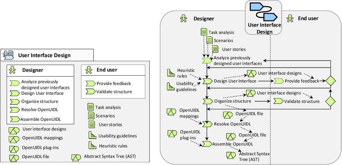
Decoupled design architectures are becoming common as more organizations embrace headless approaches to content delivery. Yet many teams encounter issues when implementing a decoupled approach. What needs to happen to get them unstuck?
Digital experts have long advocated for separating or decoupling content from its presentation. This practice is becoming more prevalent with the adoption of headless CMSs, which decouple content from UI design.
Yet decoupling has been held back by UI design practices. Enterprise UX teams rely on design systems too much as the basis for organizing UIs, creating a labor-intensive process for connecting content with UI components.
Why decoupled design is hard
Decoupled design, where content and UI are defined independently, represents a radical break from incumbent practices used by design teams. Teams have been accustomed to defining UI designs first before worrying about the content. They create wireframes (or more recently, Figma files) that reflect the UI design, whether that’s a CMS webpage template or a mobile app interface. Only after that is the content developed.
Decoupled design is still unfamiliar to most enterprise UX teams. It requires UX teams to change their processes and learn new skills. It requires robust conceptual thinking, proactively focusing on the patterns of interactions rather than reactively responding to highly changeable details.
The good news: Decoupling content and design delivers numerous benefits. A decoupled design architecture brings teams flexibility that hasn’t been possible previously. Content and UI design teams can each focus on their tasks without generating bottlenecks arising from cross-dependencies. UI designs can change without requiring the content be rewritten. UI designers can understand what content needs to be presented in the UI before they start their designs. Decoupling reduces uncertainty and reduces the iteration cycles associated with content and UI design changes needing to adjust to each other.
It’s also getting easier to connect content to UI designs. I have previously argued that New tools, such as RealContent, can connect structured content in a headless CMS directly to a UI design in Figma. Because decoupled design is API-centric, UX teams have the flexibility to present content in almost any tool or framework they want.
The bad news: Decoupled design processes still require too much manual work. While they are not more labor intensive than existing practices, decoupled design still requires more effort than it should.
UI designers need to focus on translating content requirements into a UI design. The first need to look at the user story or job to be done and translate that into an interaction flow. Then, they need to consider how users will interact with content on screen by screen. They need to map the UI components presented in each screen to fields defined in the content model
When UX teams need to define these details, they are commonly starting from scratch. They map UI to the content model on a case-by-case basis, making the process slow and potentially inconsistent. That’s hugely inefficient and time-consuming.
Decoupled design hasn’t been able to realize its full potential because UX design processes need more robust ways of specifying UI structure.
UI design processes need greater maturity
Design systems are limited in their scope. In recent years, much of the energy in UI design processes has centered around developing design systems. Design systems have been important in standardizing UI design presentations across products. They have accelerated the implementation of UIs.
Design systems define specific UI components, allowing their reusability.
But it’s essential to recognize what design systems don’t do. They are just a collection of descriptions of the UI components that are available for designers to use if they decide to. I’ve previously argued that Design systems don’t work unless they talk to content models.
Design systems, to a large extent, are content-agnostic. They are a catalog of empty containers, such as cards or tiles, that could be filled with almost anything. They don’t know much about the meaning of the content their components present, and they aren’t very robust in defining how the UI works. They aren’t a model of the UI. They are a style guide.
Design systems define the UI components’ presentation, not the UI components’ role in supporting user tasks. They define the styling of UI components but don’t direct which component must be used. Most of these components are boxes constructed from CSS.
Unstructured design is a companion problem to unstructured content. Content models arose because unstructured content is difficult for people and machines to manage. The same problem arises with unstructured UI designs.
Many UI designers mistakenly believe that their design systems define the structure of the UI. In reality, they define only the structure of the presentation: which box is embedded in another box. While they sometimes contain descriptive annotations explaining when and how the component can be used, these descriptions are not formal rules that can be implemented in code.
Cascading Style Sheets do not specify the UI structure; it only specifies the layout structure. No matter how elaborately a UI component layout is organized in CSS or how many layers of inheritance design tokens contain, the CSS does not tell other systems what the component is about.
Designers have presumed that the Document Object Model in HTML structures the UI. Yet, the structure that’s defined by the DOM is rudimentary, based on concepts dating from the 1990s, and cannot distinguish or address a growing range of UI needs. The DOM is inadequate to define contemporary UI structure, which keeps adding new UI components and interaction affordances. Although the DOM enables the separation of content from its presentation (styling), the DOM mixes content elements with functional elements. It tries to be both a content model and a UI model but doesn’t fulfill either role satisfactorily.
Current UIs lack a well-defined structure. It’s incredible that after three decades of the World Wide Web, computers can’t really read what’s on a webpage. Bots can’t easily parse the page and know with confidence the role of each section. IT professionals who need to migrate legacy content created by people at different times in the same organization find that there’s often little consistency in how pages are constructed. Understanding the composition of pages requires manual interpretation and sleuthing.
Even Google has trouble understanding the parts of web pages. The problem is acute enough that a Google research team is exploring using machine vision to reverse engineer the intent of UI components. They note the limits of DOMs: “Previous UI models heavily rely on UI view hierarchies — i.e., the structure or metadata of a mobile UI screen like the Document Object Model for a webpage — that allow a model to directly acquire detailed information of UI objects on the screen (e.g., their types, text content and positions). This metadata has given previous models advantages over their vision-only counterparts. However, view hierarchies are not always accessible, and are often corrupted with missing object descriptions or misaligned structure information.”
The lack of UI structure interferes with the delivery of structured content. One popular attempt to implement a decoupled design architecture, the Blocks Protocol spearheaded by software designer Joel Spolsky, also notes the unreliability of current UI structures. “Existing web protocols do not define standardized interfaces between blocks [of content] and applications that might embed them.”
UI components should be machine-readable
Current UI designs aren’t machine-readable – they aren’t intelligible to systems that need to consume the code. Machines can’t understand the idiosyncratic terminology added to CSS classes.
Current UIs are coded for rendering by browsers. They are not well understood by other kinds of agents. The closest they’ve come is the addition of WAI-ARIA code that adds explicit role-based information to HTML tags to help accessibility agents interpret how to navigate contents without audio, visual, or haptic inputs and outputs. Accessibility code aims to provide parity in browser experiences rather than describe interactions that could be delivered outside of a browser context. Humans must still interpret the meaning of widgets and rely on browser-defined terminology to understand interaction affordances.
The failure of frontend frameworks to declare the intent of UI components is being noticed by many parties. UI needs a model that can specify the purpose of the UI component so that it can be connected to the semantic content model.
A UI model will define interaction semantics and rules for the functional capabilities in a user interface. A UI model needs to define rules relating to the functional purpose of various UI components and when they must be used. A UI model will provide a level of governance missing from current UI development processes, which rely on best-efforts adherence to design guidelines and don’t define UI components semantically.
When HTML5 was introduced, many UI designers hailed the arrival of “semantic HTML.” But HTML tags are not an adequate foundation for a UI model. HTML tags are limited to a small number of UI elements that are overly proscriptive and incomplete. HTML tags describe widgets like buttons rather than functions like submit or cancel. While historically, actions were triggered by buttons, that’s no longer true today. Users can invoke actions using many UI affordances. UI designers may change UI element supporting an action from a button to a link if they change the context where the action is presented, for example. Hard-coding the widget name to indicate its purpose is not a semantic approach to managing UIs. This issue becomes more problematic as designers must plan for multi-modal interaction across interfaces.
UI specifications must transcend the widget level. HTML tags and design system components fall short of being viable UI models because they specify UI instances rather than UI functions. A button is not the only way for a user to submit a request. Nor is a form the only way for a user to submit input.
When a designer needs to present a choice to users, the design system won’t specify which UI component to use. Rather it will describe a range of widgets, and it is up to the designer to figure out how they want to present the choice.
Should user choices be presented as a drop-down menu? A radio button? A slider? Design systems only provide descriptive guidance. The UI designer needs to read and interpret them. Rarely will the design system provide a rule based on content parameters, such as if the number of choices is greater than three, and the choice text is less than 12 characters, use a drop-down.
UIs should be API-ready. As content becomes more structured, semantically defined, and queriable via APIs, the content needs the UI designs that present it to be structured, too. Content queries need to be able to connect to UI objects that will present the content and allow interaction with the content. Right now, this is all done on an ad hoc basis by individual designers.
Let’s look at the content and UI sides from a structural perspective.
On the content side, a field may have a series of enumerated values: predefined values such as a controlled vocabulary, taxonomy terms, ordinal values, or numeric ranges. Those values are tracked and managed internally and are often connected to multiple systems that process information relating to the values.
On the UI side, users face a range of constrained choices. They must pick from among the presented values. The values might appear as a pick list (or a drop-down menu or a spinner). The first issue, noted by many folks, is the naming problem in design systems. Some systems talk about “toasts,” while other systems don’t refer to them. UI components that are essentially identical in their outward manifestations can operate under different names.
Why is this component used? The bigger structural problem is defining the functional purpose of the UI component. The component chosen may change, but its purpose will remain persistent. Currently, UI components are defined by their outward manifestation rather than their purpose. Buttons are defined generically as being primary or secondary – expressed in terms of the visual attention they draw – rather than the kind of actions the button invokes (confirm, cancel, etc.)
Constrained choice values can be presented in multiple ways, not just as a drop-down menu. It could be a slider (especially if values are ranked in some order) or even as free text where the user enters anything they wish and the system decides what is the closest match to enumerated values managed by the system.
A UI model could define the component as a constrained value option. The UI component could change as the number of values offered to users changed. In principle, the component updating could be done automatically, provided there were rules in place to govern which UI component to use under which circumstances.
The long march toward UI models
A design system specifies how to present a UI component: its colors, size, animation behaviors, and so on. A UI model, in contrast, will specify what UI component to present: the role of the component (what it allows users to do) and the tasks it supports.
Researchers and standards organizations have worked on developing UI models for the past two decades. Most of this work is little known today, eclipsed by the attention in UI design to CSS and Javscript frameworks.
In the pre-cloud era, at the start of the millennium, various groups looked at how to standardize descriptions of the WIMP (windows, icons, menu, pointers) interface that was then dominant. The first attempt was Mozilla’s XUL. A W3C group drafted a Model-Based User Interfaces specification (MBUI). Another coalition of IBM, Fujitsu, and others developed a more abstract approach to modeling interactions, the Software & Systems Process Engineering Meta-Model Specification.
Much of the momentum for creating UI models slowed down as UI shifted to the browser with the rise of cloud-based software. However, the need for platform-independent UI specification continues.
Over the past decade, several parties have pursued the development of a User Interface Description Language (UIDL). “A User Interface Description Language (UIDL) is a formal language used in Human-Computer Interaction (HCI) in order to describe a particular user interface independently of any implementation….meta-models cover different aspects: context of use (user, platform, environment), task, domain, abstract user interface, concrete user interface, usability (including accessibility), workflow, organization, evolution, program, transformation, and mapping.”
Another group defines UIDL as “a universal format that could describe all the possible scenarios for a given user interface.”
Task and scenario-driven UI modeling. Source: OpenUIDL
Planning beyond the web. The key motivation has been to define the user interface independently of its implementation. But even recent work at articulating a UIDL has largely been web-focused.
Providing a specification that is genuinely independent of implementation requires that it not be specific to any delivery channel. Most recently, a few initiatives have sought to define a UI model that is channel agnostic.
One group has developed OpenUIDL, “a user interface description language for describing omnichannel user interfaces with its semantics by a meta-model and its syntax based on JSON.”
UI models should work across platforms. Much as content models have allowed content to be delivered to many channels via APIs, UI models are needed to specific user interaction across various channels. While responsive design has helped allow a design to adapt to different devices that use browsers, a growing range of content is not browser-based. In addition to emerging channels such as mixed reality (XR) promoted by Apple and Meta and Generative AI chatbots promoted by Microsoft, Google, OpenAI, and others, the IoT revolution is creating more embedded UIs in devices of all kinds.
The need for cross-platform UI models isn’t only a future need. It shapes companies’ ability to coordinate decades-old technologies such as ATMs, IVRs, and web browsers.
A model can support a ‘portable UI.’ A prominent example of the need for portable UIs comes from the financial sector, which relies on diverse touchpoints to service customers. One recent UI model focused on the financial industry is called Omni-script. It provides “a basic technique that uses a JSON based user interface definition format, called omni-script, to separate the representation of banking services in different platforms/devices, so-called channels….the target platforms that the omnichannel services span over contains ATMs, Internet banking client, native mobile clients and IVR.”
The ideal UI model will be simple enough to implement but flexible enough to address many modes of interaction (including natural language interfaces) and UI components that will be used in various interfaces.
Abstraction enables modularity. UI models share a level of abstraction that is missing in production-focused UI specifications.
The process of abstraction starts with an inventory of UI components a firm has deployed across channels and touchpoints. Ask what system and user functionality each component supports. Unlike design systems development, which looks to standardize the presentation of components, UI models seek to formalize how to describe the role of each component in supporting a user or system task.
The abstraction of UI components according to the tasks they support. Source: W3C Model-Based UI XG
Suppose the functionality is intended to provide help for users. Help functionality can be further classified according to the kind of help offered. Will the functionality diagnose a problem, guide users in making a decision, disambiguate an instruction, introduce a new product feature, or provide an in-depth explanation of a topic?
A UI model maps relationships. Consider functionality that helps users disambiguate the meaning of content. We can refer to UI components as disambiguation elements in the UI model (a subset of help elements) whose purpose is to clarify the user’s understanding of terms, statements, assertions, or representations. They would be distinct from confirmation elements that are presented to affirm that the user has seen or heard information and acknowledges or agrees to it. The model would enumerate different UI elements that the UI design can implement to support disambiguation. Sometimes, the UI element will be specific to a field or data type. Some examples of disambiguation elements are:
Tooltips used in form instructions or labels
“Explain” prompt requests used in voice bots
Annotations used in text or images
Visual overlays used in photos, maps, or diagrams
Did-you-mean counter-suggestions used in text or voice search
See-also cross-references used in menus, indexes, and headings
The model can further connect the role of the UI element with:
When it could be needed (the user tasks such as content navigation, information retrieval, or providing information)
Where the elements could be used (context of application, such as a voice menu or a form.)
The model will show the M:N relationships between UI components, UI elements, UI roles and subroles, user tasks, and Interaction contexts. Providing this traceability will facilitate a rules-based mapping between structured content elements defined in the content model with cross-channel UX designs delivered via APIs. As these relationships become formalized, it will be possible to automate much of this mapping to enable adaptive UI designs across multiple touchpoints.
The model modularizes functionality based on interaction patterns. Designers can combine functional modules in various ways. They can provide hybrid combinations when functional modules are not mutually exclusive, as in the case of help. They can adapt and adjust them according to the user context: what information the user knows or has available, or what device they are using and how readily they can perform certain actions.
What UI models can deliver that’s missing today
A UI model allows designers to focus on the user rather than the design details of specific components, recognizing that multiple components could be used to support users, It can provide critical information before designers choose a specific UI component from the design system to implement for a particular channel.
Focus the model on user affordances, not widgets. When using a UI model, the designer can focus on what the user needs to know before deciding how users should receive that information. They can focus on the user’s task goals – what the user wants the computer to do for them – before deciding how users must interact with the computer to satisfy that need. As interaction paradigms move toward natural language interfaces and other non-GUI modalities, defining the interaction between users, systems, and content will be increasingly important. Content is already independent of a user interface, and interaction should become unbound to specific implementations as well. Users can accomplish their goals by interacting with systems on platforms that look and behave differently.
Both content and interactions need to adapt to the user context.
What the user needs to accomplish (the user story)
How the user can achieve this task (alternative actions that reflect the availability of resources such as user or system information and knowledge, device capabilities, and context constraints
The class of interaction objects that allow the user to convey and receive information relating to the task
Much of the impetus for developing UI models has been driven by the need to scale UI designs to address complex domains. For UI designs to scale, they must be able to adapt to different contexts.
UI models enable UX orchestration. A UI model can represent interactions at an abstract level so that content can be connected to the UI layer independently of which UI is implemented or how the UI is laid out.
For example, users may want to request a change, specify the details of a change, or confirm a change. All these actions will draw on the same information. But they could be done in any order and on various platforms using different modalities.
Users live in a multi-channel, multi-modal world. Even a simple action, such as confirming one’s identity while online, can be done through multiple pathways: SMS, automated phone call, biometric recognition, email, authenticator apps, etc.
When firms specify interactions according to their role and purpose, it becomes easier for systems to hand off and delegate responsibilities to different platforms and UIs that users will access. Currently, this orchestration of the user experience across touchpoints is a major challenge in enterprise UX. It is difficult to align channel-specific UI designs with the API layer that brokers the content, data, and system responses across devices.
UI models can make decoupled design processes work better
UI models can bring greater predictability and governance to UI implementations. Unlike design systems, UI models do not rely on not voluntary opt-in by individual developers. They become an essential part of the fabric of the digital delivery pipeline and remove inconsistent ways developers may decide to connect UI components to the content model – sometimes derisively referred to as “glue code.” Frontend developers still have options about which UI components to use, provided the UI component matches the role specified in the UI model.
UI governance is a growing challenge as new no-code tools allow business users to create their UIs without relying on developers. Non-professional designers could use components in ways not intended or even create new “rogue” containers. A UI model provides a layer to govern UIs so that the components are consistent with their intended purpose.
UI models can link interaction feedback with content. A UI model can provide a metadata layer for UIs. It can, for example, connect state-related information associated with UI components such as allowed, pending, or unavailable with content fields. This can reduce manual work mapping these states, making implementation more efficient,
An opportunity to streamline API management. API federation is currently complex to implement and difficult to understand. The ad hoc nature of many federations often means that there can be conflicting “sources of truth” for content, data, and transactional systems of record.
Many vendors are offering tools providing composable front-ends to connect with headless backends that supply content and data. However, composable frontends are still generally opinionated about implementation, offering a limited way to present UIs that don’t address all channels or scenarios. A UI model could support composable approaches more robustly, allowing design teams to implement almost any front end they wish without difficulty.
UI models can empower business end-users. Omnichannel previews are challenging, especially for non-technical users. By providing a rule-based encoding of how content is related to various presentation possibilities in different contexts and on various platforms, UI models can enable business users to preview different ways customers will experience content.
UI models can future-proof UX. User interfaces change all the time, especially as new conventions emerge. The decoupling of content and UI design makes redesign easier, but it is still challenging to adapt a UI design intended for one platform to present on another. When interactions are grounded in a UI model, this adaptation process becomes simpler.
The work ahead
While a few firms are developing UI models, and a growing number are seeing the need for them, the industry is far from having an implementation-ready model that any firm can adopt and use immediately. Much more work is needed.
One lesson of content models is that the need to connect systems via APIs drives the model-making process. It prompts a rethinking of incumbent practices and a willingness to experiment. While the scope of creating UI models may seem daunting, we have more AI tools to help us locate common interaction patterns and catalog how they are presented. It’s becoming easier to build models.
Markup is supposed to make content better. So why does it frequently make content worse?
Markup helps computers know how to render text in a user interface. Without markup, text is plain — a string of characters. That’s fine for simple communications, but plain text can’t express more complex ideas.
Syntax enables words to become meaningful content. Markup is syntax for computers. But computer syntax is far different from the syntax that writers and readers use.
HTML is the universal markup language for the web. Markdown is positioned as a light-weight alternative to HTML that’s used by some writing apps and publishing systems. Some content developers treat Markdown as hybrid syntax that offers a common language for both humans and machines, a sort of “singularity” for text communication. Sadly, there’s no language that is equally meaningful for both humans and machines. If humans and machines must use the same syntax, both need to make compromises and will encounter unanticipated outcomes.
Markup is a cognitive tax. Code mixed into text interferes with the meaning of the writer’s words, which is why no one writes articles directly in HTML. Text decorated with markup is hard for writers and editors to read. It distracts from what the text is saying by enveloping words with additional characters that are neither words or punctuation. When writers need to insert markup in their text, they are likely to make mistakes that cause the markup to be difficult for computers to read as well.
Each morning, while browsing my iPad, I see the problems that markup creates for authors and for readers. They appear in articles in Apple News, crisply presented in tidy containers.
Apple News format
Apple News publishes text content using a subset of either HTML or Markdown. Apple cautions that authors need to make sure that any included markup is syntactically correct:
“Punctuation Is Critical. Incorrect punctuation in your article.json file—even a misplaced comma or a curly quotation mark instead of a straight quote—will generate an error when you try to preview your article.”
That’s the trouble with markup — it depends heavily on its placement. A missing space or an extra one can spell trouble. Developers understand this, but authors won’t expect that the formatting of their writing to present problems in the third decade of the 21st century. They’ve heard that AI will soon replace writers. Surely computers are smart enough to format written text correctly.
Often, markup triggers a collision between computer syntax for text and computer syntax for code. This is especially the case for reserved characters: specific characters that a computer program has decided that it gets to use and that will have priority over any other uses of that character. Computer code and written prose also use some of the same punctuation symbols to indicate meaning. But the intents associated with these punctuation marks are not the same.
Consider the asterisk. It can act like a footnote in text. In computer code, it might signal a function. In Markdown, it can be a bullet or signify the bolding of text. In example below, we see two asterisks around the letter “f”. The author’s goal isn’t clear, but it would appear these were intended to bold the letter, except that an extra space prevented the bolding.
Misfired asterisk
If there was any symbol that logically should be standardized in meaning and use, it would be the quotation mark. After all, quotation marks indicate that the text within them is unmodified or should not be modified. But there are various conventions for expressing quotations using different characters. Among machines and people there’s no agreement about how to express quotation marks and what precisely they convey.
A highly visible failure occurs when quoted text is disrupted. Text in quotes is supposed to be important. The example below attempts to insert quotation marks around a phrase, but instead the Unicode for single quotes are rendered.
Misfired scare quotes
Here’s another example of quotes. The author has tried to tell the code that these quotes are meant to be displayed. But the backslash escape characters show in addition to the quote characters. A quotation mark is not a character to escape in Markdown. I see this problem repeatedly with Reuters posts on Apple News.
The jargon escapes comprehension
This example has quotes mixed with apostrophes, and possibly an en dash — all being rendered as “ȃ”. The code is confused about what is intended, as is the reader.
Adding a French accent
Here’s a mystery: “null” starts a new paragraph. Maybe some Javascript code was looking for something it didn’t find. Because the Null follows a link that ends with a quote, it seems likely that part of the confusion was generated by how the link was encoded.
Null results
Here’s another example of link trouble. The intro is botched because the Markdown is incorrectly coded. The author couldn’t figure out where to indicate italics while presenting linked text, and tried too hard.
A not-too-stylish welcome
Takeaways
All these examples come from paid media created by professional staff. If publishers dependent on revenues can make these kinds of mistakes, it seems likely such mistakes are even more common among people in enterprises who write web content on a less frequent basis.
Authors shouldn’t have to deal with markup. Don’t assume that any kind of markup is simple for authors. Some folks argue that Markdown is the answer to the complexity of markup. They believe Markdown democratizes markup: it is so easy anyone can use it correctly. Markdown may appear less complex than HTML but that doesn’t mean it isn’t complex. It hides its complexity by using familiar-looking devices such as spaces and punctuation in highly rigid ways.
If authors are in a position to mess up the markup, they probably will. Some formatting scenarios can be complex, requiring an understanding of how the markup prioritizes different characters and how code such as Javascript expects strings. For example, displaying an asterisk in Markdown requires that it be escaped twice with two backslashes in Apple News. That’s not the sort of detail an author on a deadline should need to worry about.